Dwell LA
ASSIMILATIVE APP + WALL MAP
UI/UX Design + Packaging/Product + Branding
Problem
Los Angeles is one of the few large American cities that is not defined by its Downtown nor relied on by its transit system. It can be notoriously difficult for newcomers to adjust to due to its sprawling nature.
This often influences residents to stick to outings in their own neighborhoods in order to avoid spending more time in traffic than necessary (or avoid leaving their homes all together). Therefore, transplants can go years living in the city without experiencing some of its most fascinating assets.
“With over 250 neighborhoods, dozens of beaches and a plethora of history, arts, restaurants and entertainment, LA is more accessible than one might think.”
Solution
Dwell LA is a self-authored brand that manufactures wall maps designed to help new Los Angeles residents assimilate into their neighborhoods. Each decorative map is packaged with a coinciding app download.
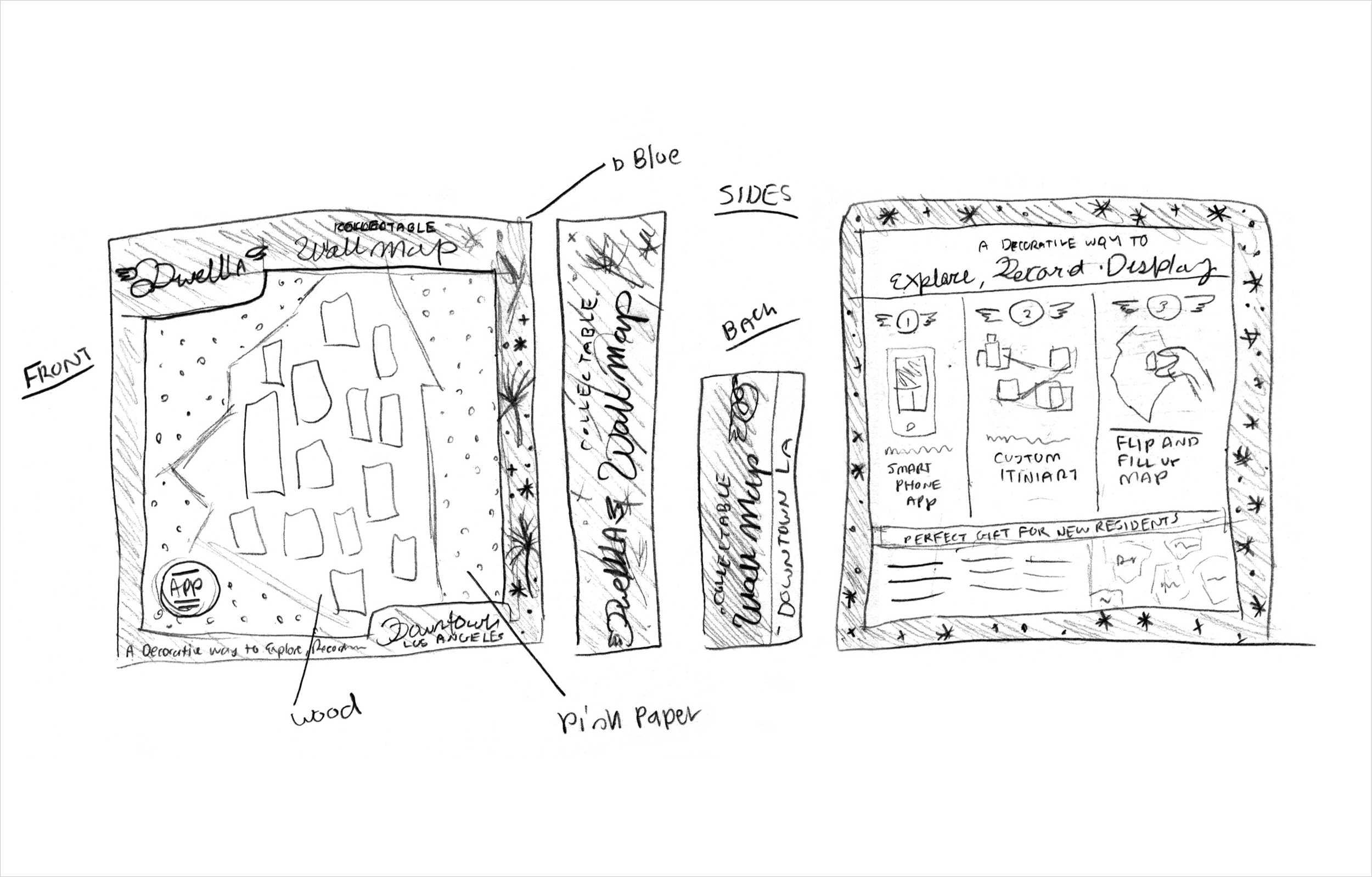
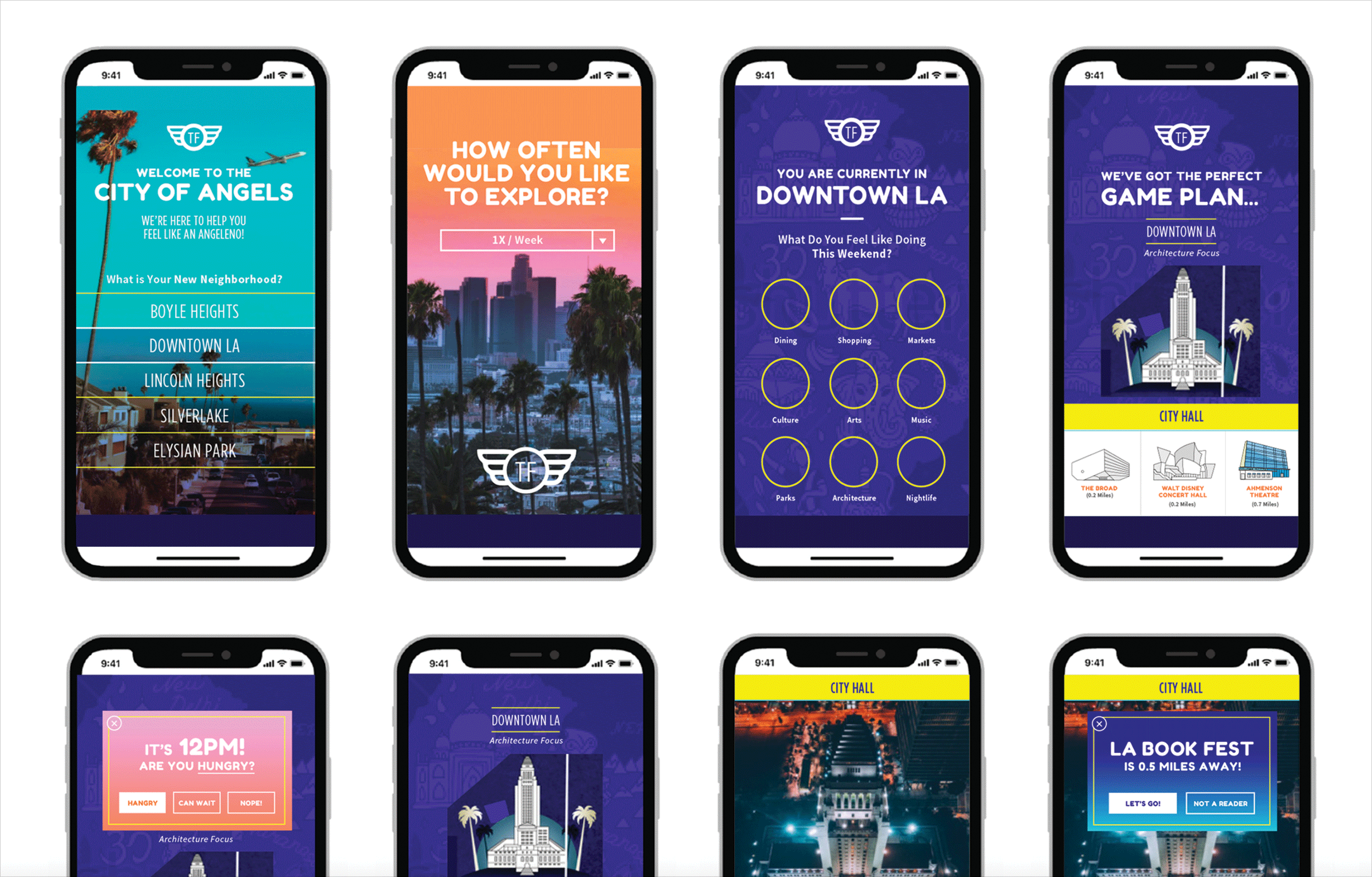
This app provides “Assimilation Tours” that gradually expose transplants to surrounding neighborhoods; eventually exposing them to the entire city. A variety of tour themes cater to the user’s specific interests including art, architecture, and history. Neighborhood maps are collectible, and may be arranged in a wall collage if desired. Pieces on the map are designed to be flipped upon visitation in order to expose a visual scale. The app uses GPS to mark off points on each tour in a matching fashion. Maps are sold in gift, novelty and decor shops across the city and make great housewarming gifts or souvenirs.
Visual Research
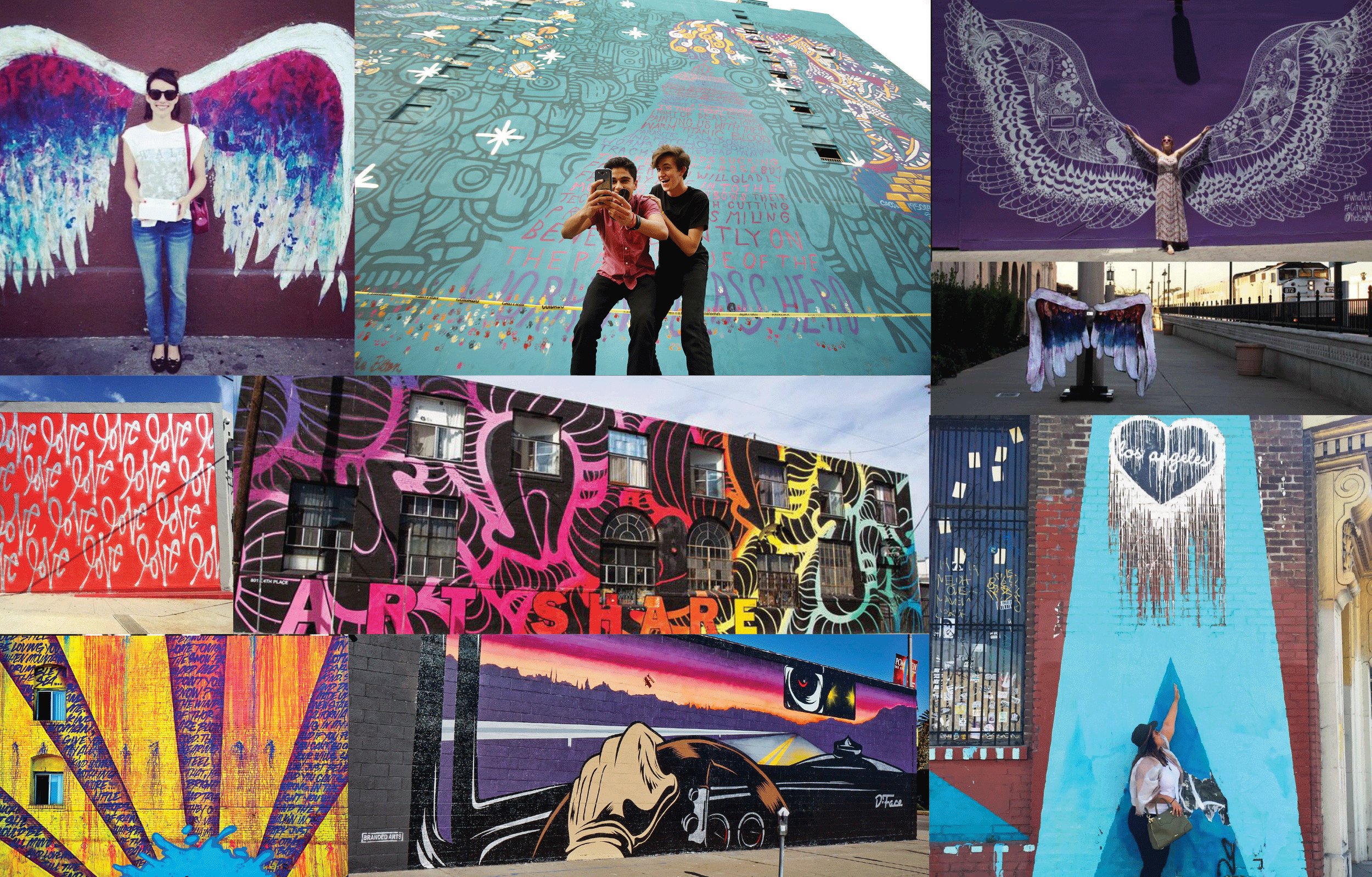
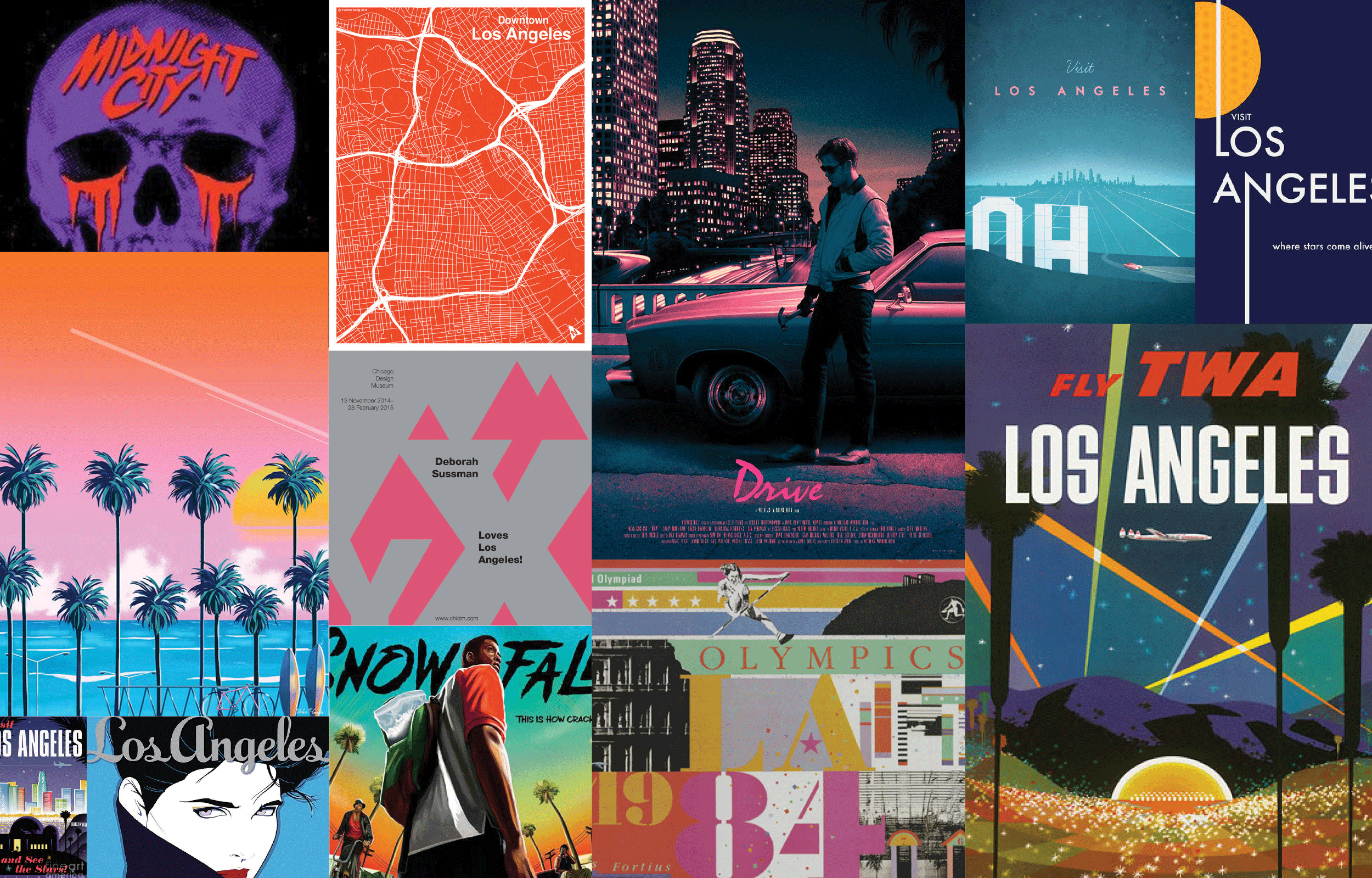
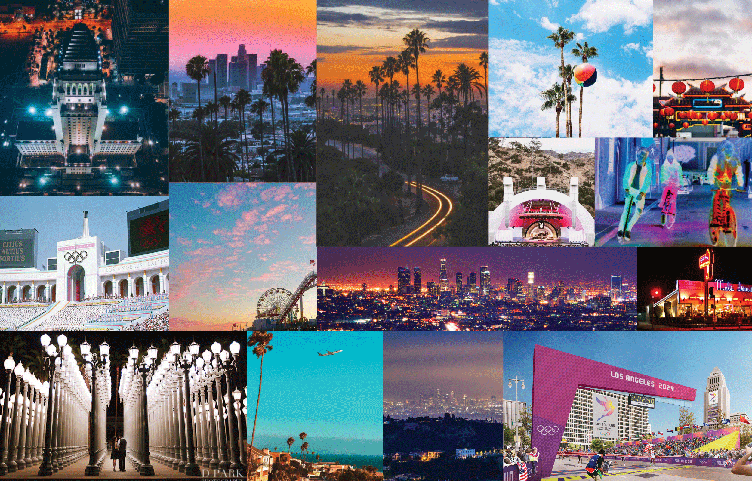
Mood Boards + Color Studies + Industry Comparisons
The following features help reflect meaning and define Dwell LA’s visual language:
- Typography inspired by the city’s arts culture with art deco references
- Color pulled from a brightly optimistic cosmopolitan palette
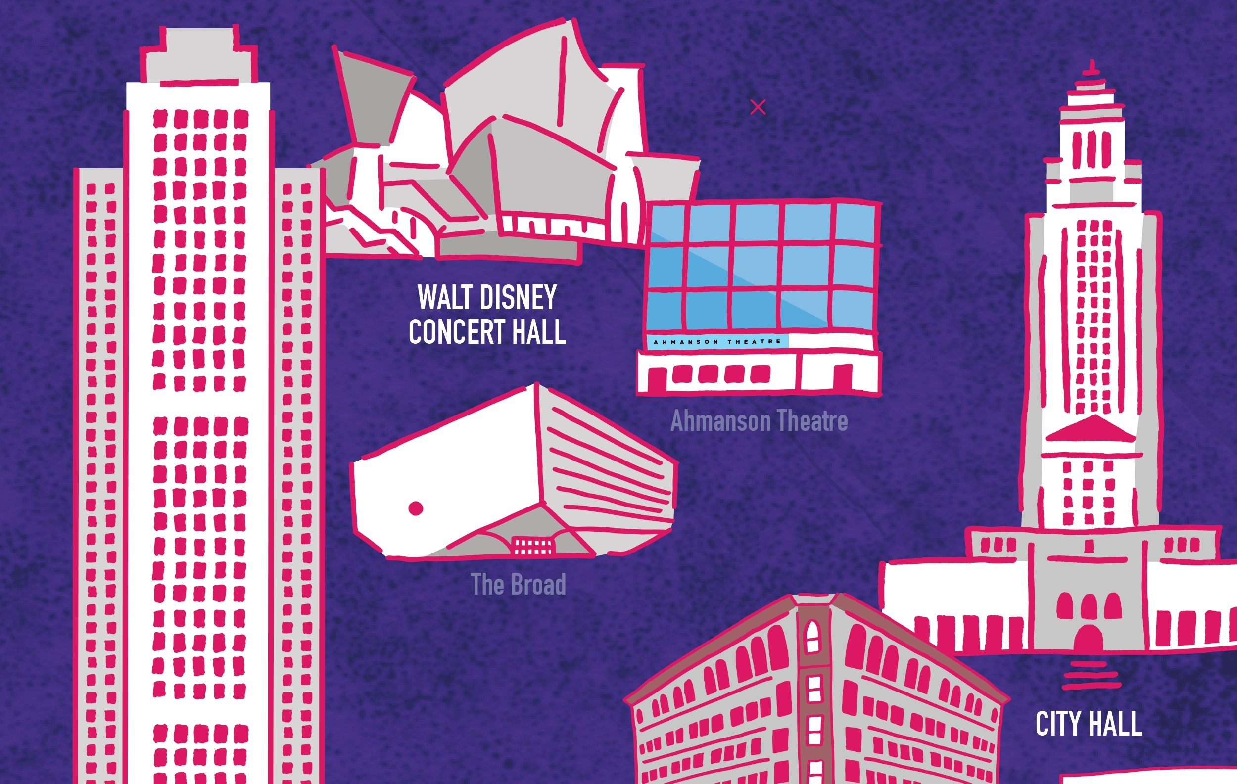
- Laid back hand-drawn illustrations inspired by the city’s street art
- Overall friendly and inviting tone
Style Exploration
Digital Sketches
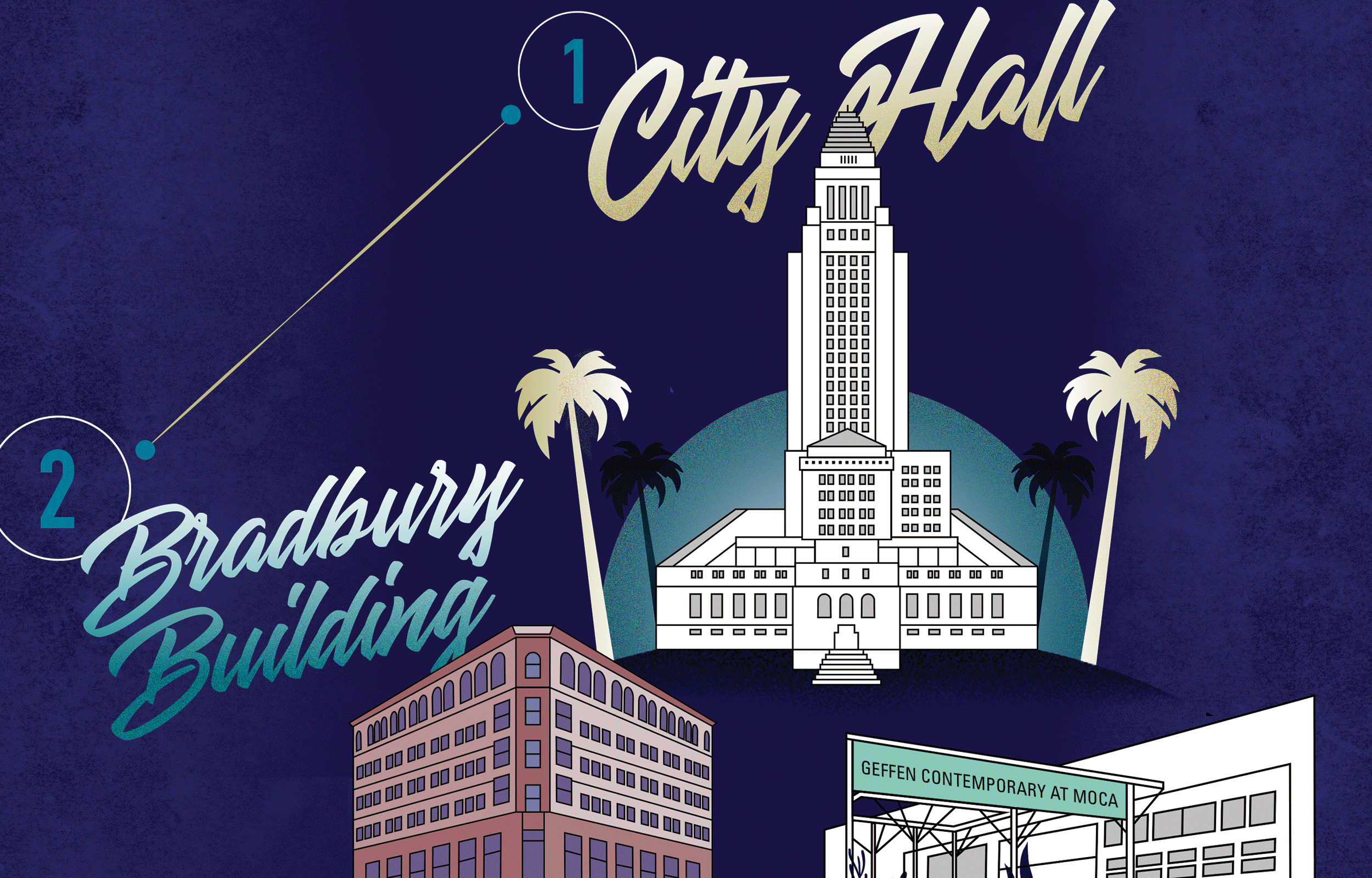
Dwell LA toggled between 1980’s-inspired vector art and loose, hand-drawn illustration styles. The result ended up somewhere in between. The final aesthetic was born on paper via pen drawings that were scanned and edited in Adobe Illustrator. They were paired with the Montebello Font family to create friendly illustrations referencing the City’s laid back, yet glamorous roots.
Process Sketches
Thumbnails
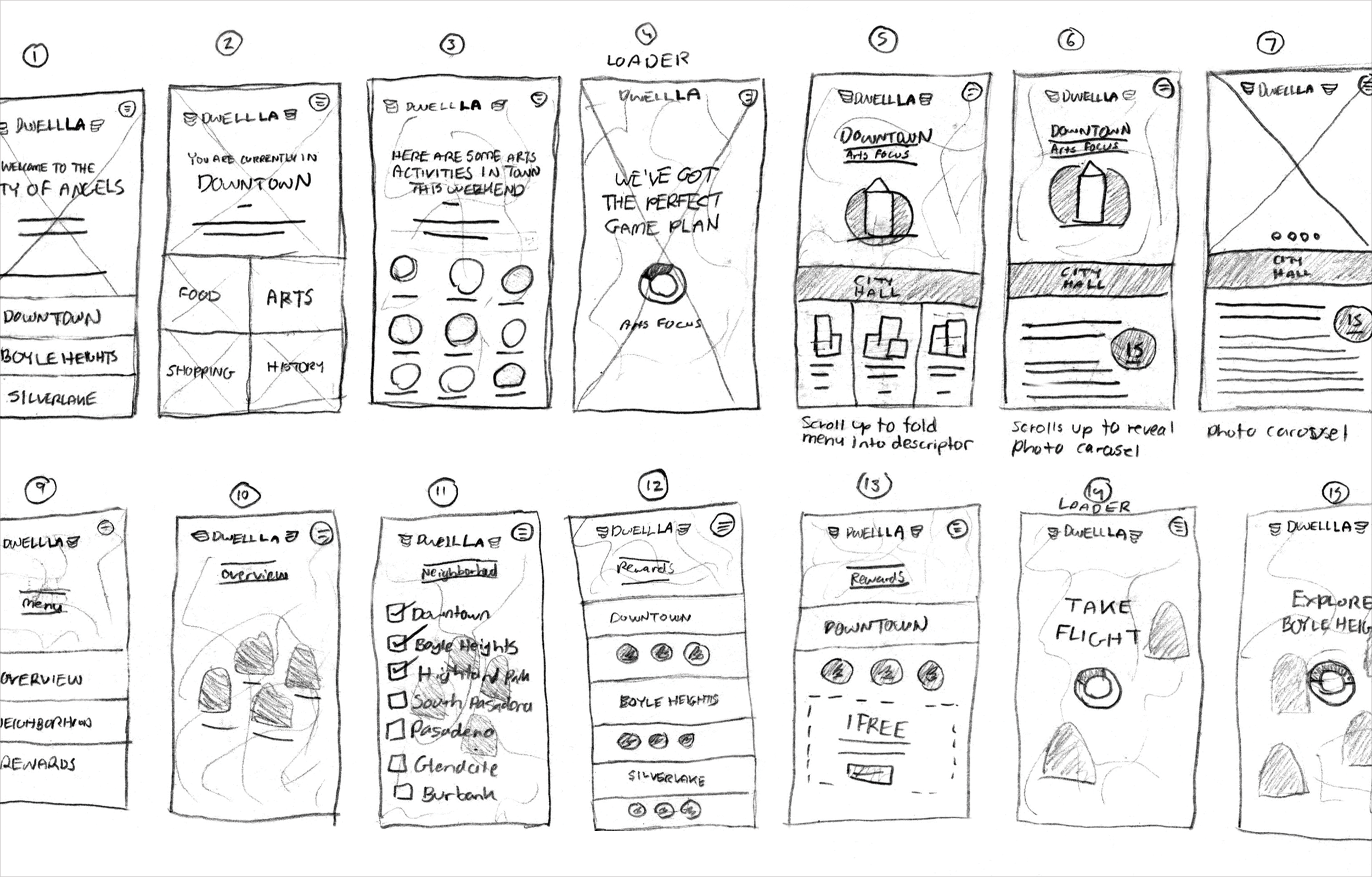
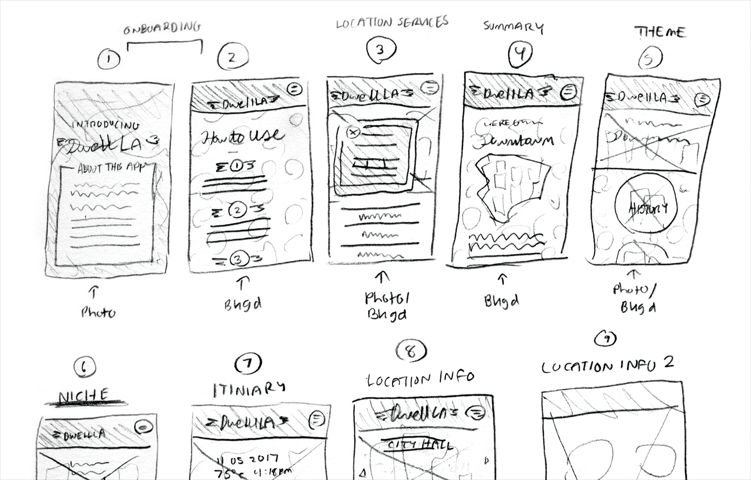
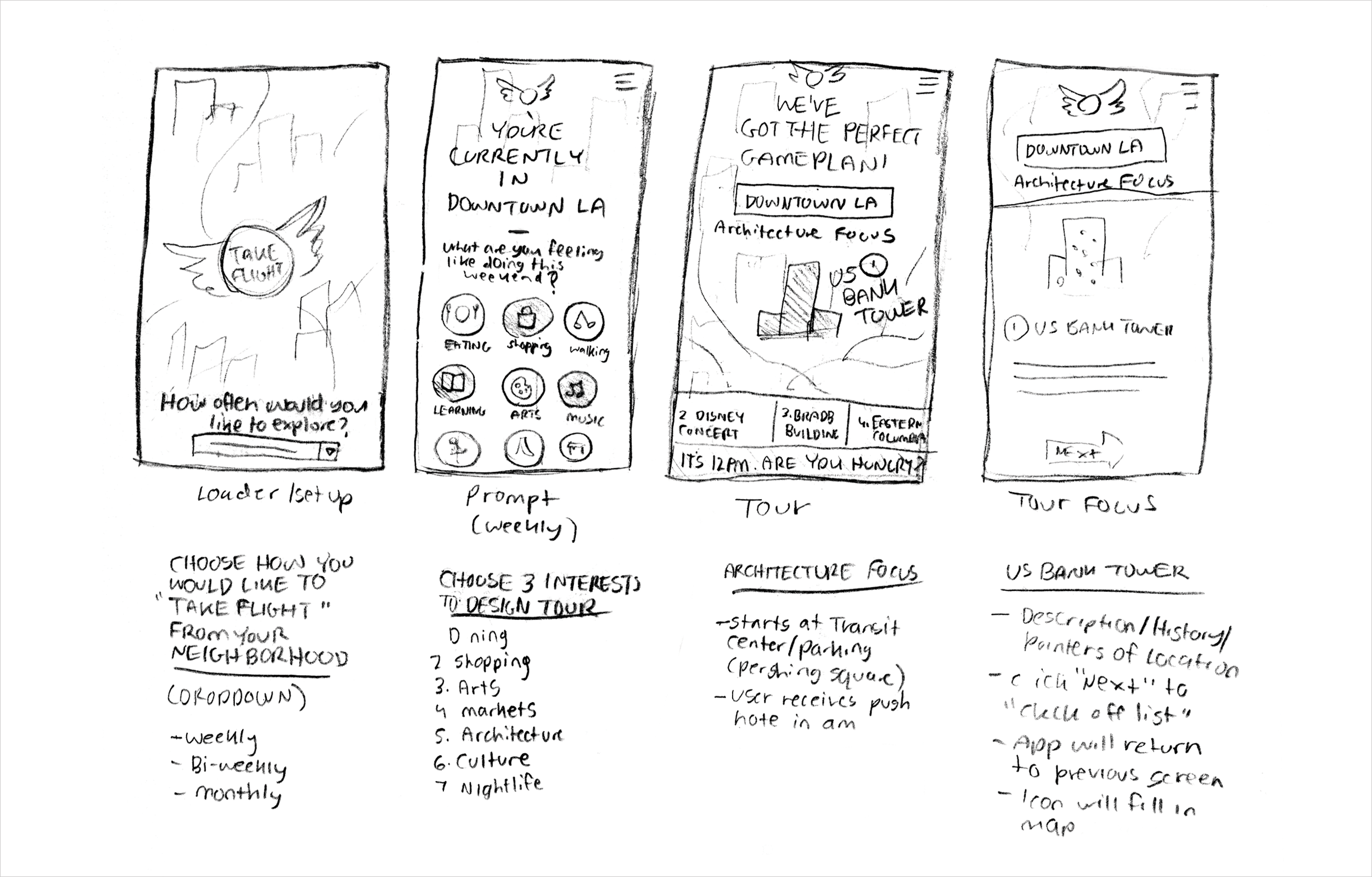
Dwell LA’s robust content was also visualized on paper before making it to the screen. This was done via thumbnail sketches of both the app wireframes and packaging design.
Content Development
Wireframing
The app for Dwell LA was fully wireframed and prototyped in Adobe XD. Content was primarily inspired by the Los Angeles Conservancy’s architectural walking tours and re-purposed for the app’s specific purpose.
WHY LOS ANGELES?
I was born in Pasadena, CA and moved from LA to Orange County when I turned 7. When I began re-exploring the city as an adult, I realized that the extent I was exposed to as a child barely scratched its surface. When I began interning and working in the city, I discovered this was especially normal for transplants and even residents who had lived in the city for several years. I continued to hear about what a hard city Los Angeles was to transition to, and Dwell LA was my answer as an Angeleno.
Additional Credits:
Bryan Satalino
Instructor
Graduate Seminar at Tyler School of Art
